Commercial Building Direction & Wayfinding Lettering
A building-wide direction plan should connect the points where visitors make a decision: entrance, reception, corridor, floor, and destination. Keep the wording consistent, then check each arrow where the label will actually be read.
Build a route, not a collection of disconnected arrows
Start with one visitor journey and list the messages needed along it. Use the same destination name throughout: changing between “Front Desk” and “Reception” can make a simple route less clear. Longer-distance visibility, accessibility, mandatory exits, and safety signage need their own requirements review; a visual mockup alone cannot settle those decisions.
Your project checklist
Walk the route from each relevant entrance to the destination.
Identify the exact decision points where a label is useful.
Check arrow direction, wording, contrast, and available space at each point.
Add the complete route’s labels to the cart and review the set before finalizing.
Can the same phrase point different ways?
The catalog includes left- and right-arrow versions of common directions. You can also edit the phrase in the studio. Review the final arrow and wording for each placement; do not assume one version works on both sides of a corridor.
USEFUL STARTING POINTS
Lettering for this project
Open a design to change the wording, color, font, and dimensions.
These are ordinary vinyl lettering options, not certified emergency, exit, tactile, or Braille signs. Confirm any applicable signage requirements separately.
Planned physical decals use quality clear transfer tape for precise alignment. Apply the lettering, then peel away the transfer tape. Surface suitability still needs to be checked.

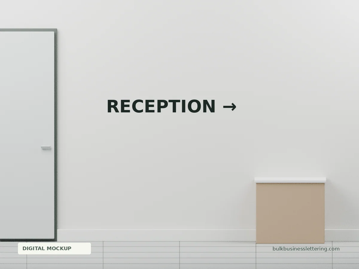 Reception →
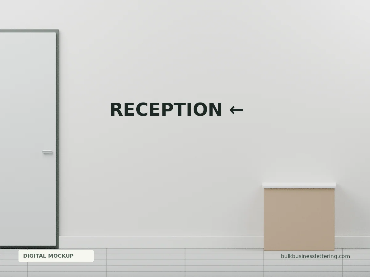 Reception ←
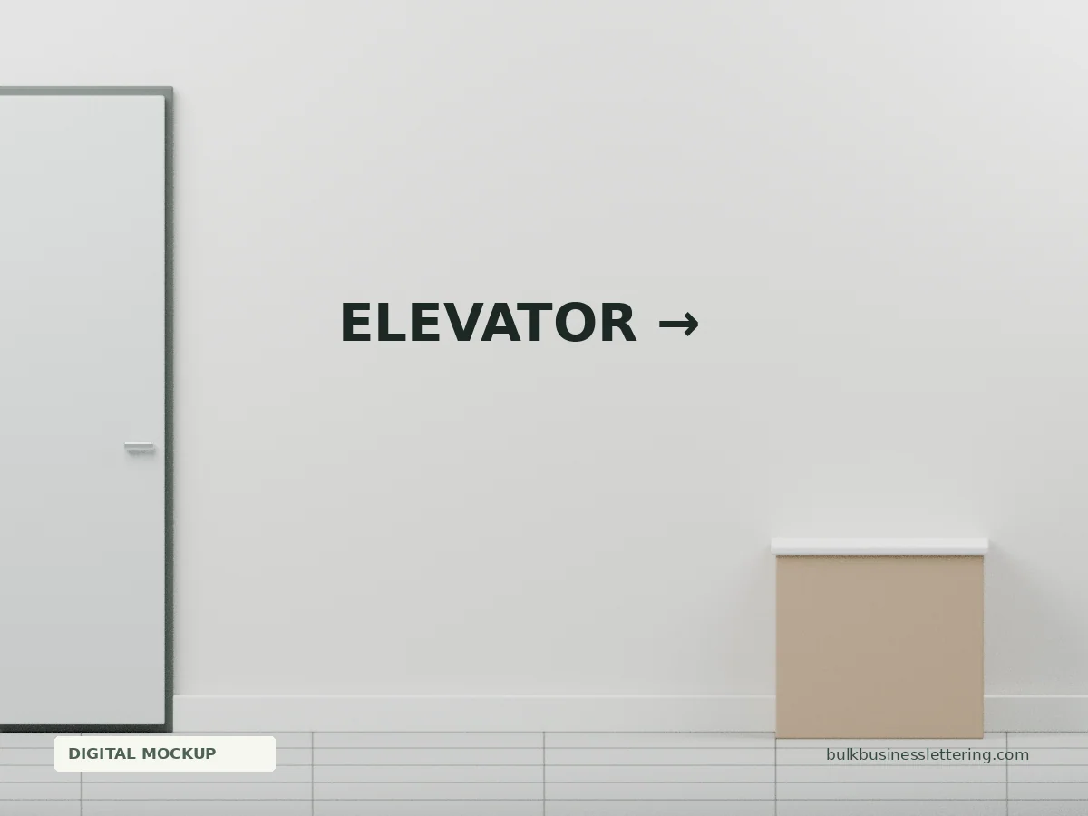 Elevator →
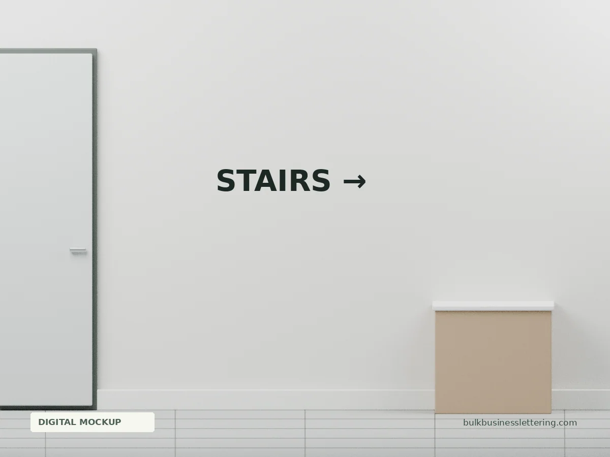 Stairs →
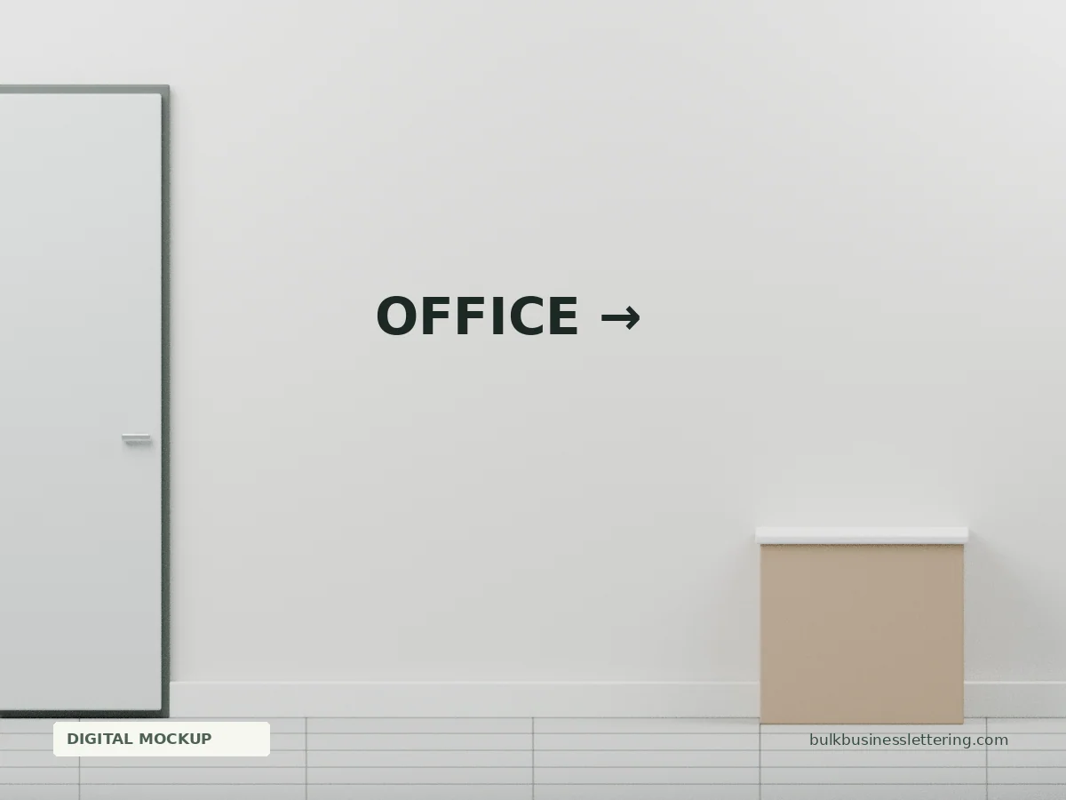 Office →
 Shipping and Receiving →